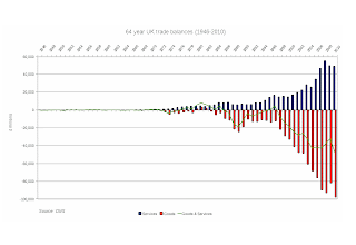
UK trade balance 1946-2010
This chart shows very well the scale, in nominal terms, of UK trade balances - which have ballooned. The balance (the green line) has barely ever been positive since the 1970s and has increased rapidly over the past decade or two.
Imports (the red bars) have increased, and at a faster rate than exports year after year. It reflects our increasing dependence on energy, commodity, and food from abroad - we can no longer provide these vital things for ourselves.
The decline in exports since the 2007 nominal peak has been achieved with the tailwind of sterling depreciation against the dollar and euro of around 30-40% over the same period - partly due to near-zero interest rates - this should have boosted exports. Instead they have fallen. The same interest rates have added to our own inflation. What happens to exports when interest rates go up and sterling appreciates? Our trade deficit gets wider, our imports get cheaper so we will buy more, our exports get more expensive so they decline.
It is hard to see how the UK could reverse this trend, we have long past the peak of North sea oil and gas production, we have mined almost all the minerals, aggregates and metals our soil contains, we manufacture less and less, our technology base is meagre, and we cannot feed ourselves. Brilliant.


Comments
Post a Comment